 Did you Know?
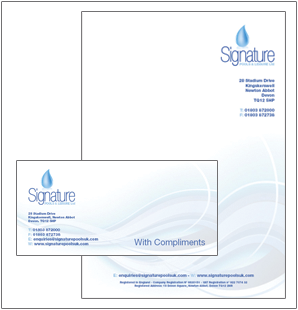
It is a legal requirement for all limited companies under section 351 of the Companies Act 1985 (as amended by The Companies (Registrar, Languages and Trading Disclosures) Regulations 2006) to display their company registration number, name and registered office address on all written communications and failure to comply is a criminal offence which may lead to a fine.
Logo Design
To support stationery, a logo is the first real image that captures your clients' attention and tantalises their imagition.
 |
 |
 |
 |
 |
 |
 |
 |

Getting the basics right with
Stationery Design

Choosing the right font for your business
Choosing a typeface can be a challenge at times. The style and shape of a type face, combined with the array of options of weights can be like a child walking into a candy store.
The first thing to consider about a typeface is to form an impression in your own mind how you want your audience to react to the font:
For example: is the font traditional, contemporary, futuristic, fun looking - all these styles create a different feel and message to your audience whilst considering legibility and readability.
For a further understanding about Serif and Sans-Serif fonts click here http://en.wikipedia.org/wiki/Serif
Creating the right mood for your font
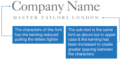
The mood of a font can be easily adapted using kerning (spacing between letters) in the typography.


Choosing the right colour combo
One of the important factors of building a strong logo is color selection. Every color represents a different feel and various moods. By choosing a color or a combination of colors for your logo, you will take on those moods
Colors can create certain emotions and feelings towards your logo so it is vital to choose a color that will represent your logo / business strongly.
- What color represents your company’s personality?
- What color suits the personality of your product/service?
- What color does your competitor(s) use?
Our colour swatch may help you decide on colour combos. Please be aware that due to colour callibration of your monitor the colour swatch should only be used for guidance puporses only for print.

Creating the right shape / layout
Should your logo be landscape, portraite, round, square, oval. Does your logo need an image / shapes to re-enforce the message?
Ideal Timber Windows needed an image to illustrate the source of its main materials, yet keeping the visual coming from a traditional aspect.


